
Just found this, and wanted to get it up here, as its important for overall context. This is the chart Gen David Petreaus showed during his Congressional testimony in April of 2008, as he reported on the progress of the ‘surge’ which began in 2007. It shows the levels of violent attacks over time, throughout Iraq.
Note that in spring/summer of 2005, corresponding with 3/2’s deployment to Al-Qaim, attacks were rising towards a peak during Ramadan in September.
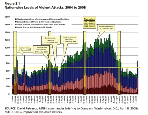
I found this in a RAND study, Foundations of the Islamic State: Management, Money and Terror in Iraq 2005-2010.
